Healthcare
2025
Overview
Designed for Community Health Workers (CHWs) to simplify data collection and provide timely education based on the critical nutritional status of children and pregnant women in Indonesia
Live site
Scope
Product Designer — defining visual style, redesigning pages, and ensuring cross-device consistency.
Tools
Figma
New design
Old design

The problem
Content overload
Organizers often upload unpredictable and extensive content, resulting in cluttered layouts and inconsistent experiences.
Clarity
Multiple course offerings made it hard for users to identify the most relevant one for their needs.
Diverse type of users
The landing pages attract a wide range of users, from beginners to tech-savvy learners. Each with different levels of digital literacy.
Most users expect websites to work the same way they’re used to.
So, I analyzed how other platforms operate to uncover best practices.
By applying these best practices, we aimed to reduce user drop-offs during course enrollments.
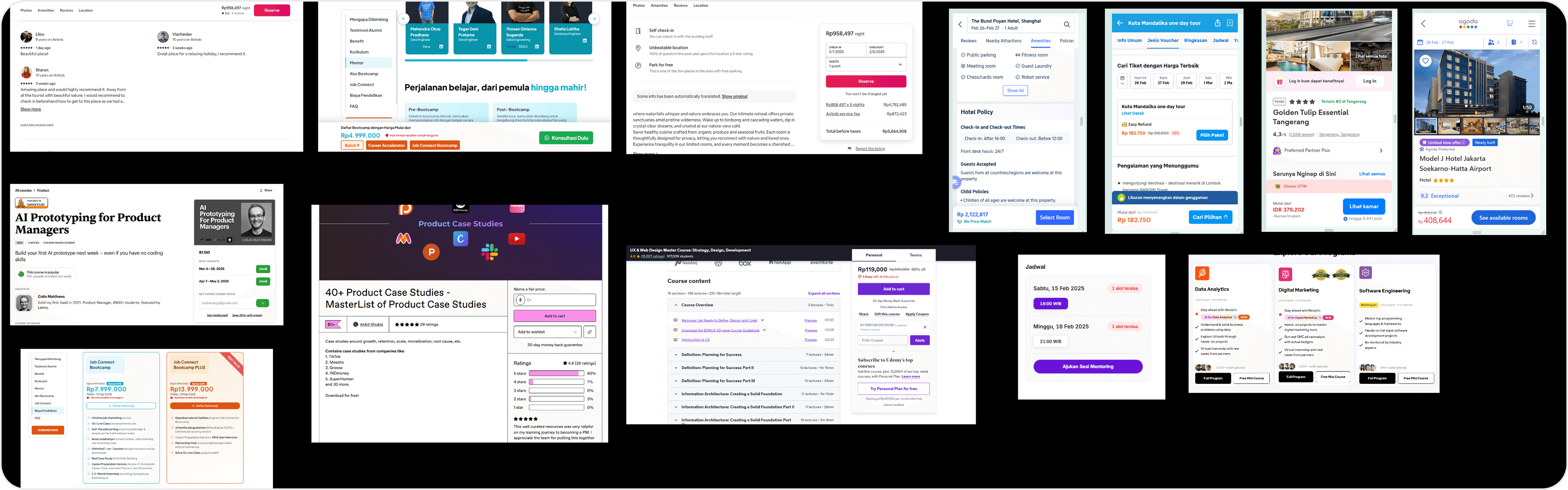
Key insight:
Clear visual hierarchy improves engagement.
Simpler navigation support faster decision-making process.
CTA placement above the fold enables clear and immediate action.
Seamless payment flow with transparent information builds trust.
The new layout enhances readability and focus, making it easier for users to engage with course content and helping organizers drive higher course enrollments and conversions.
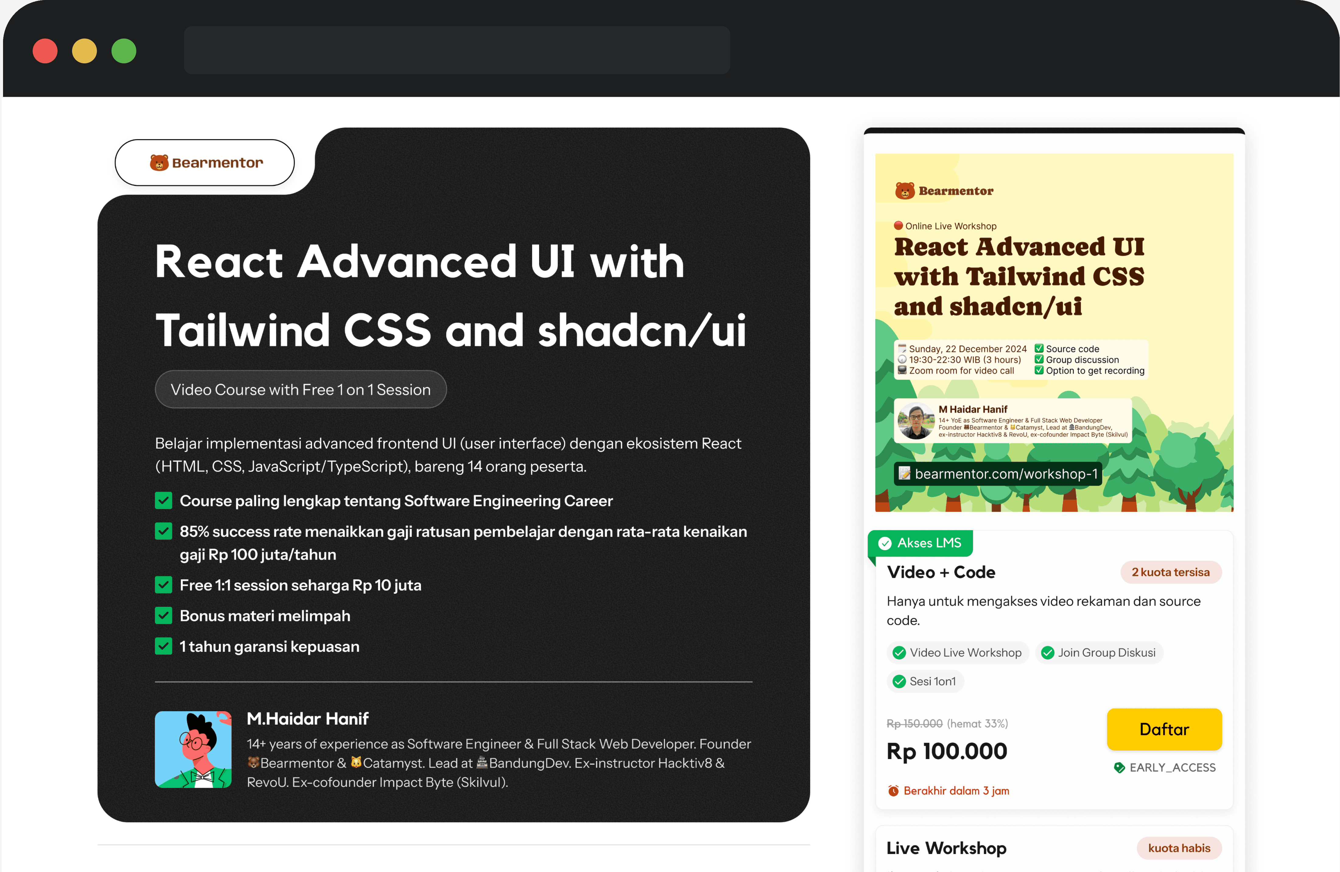
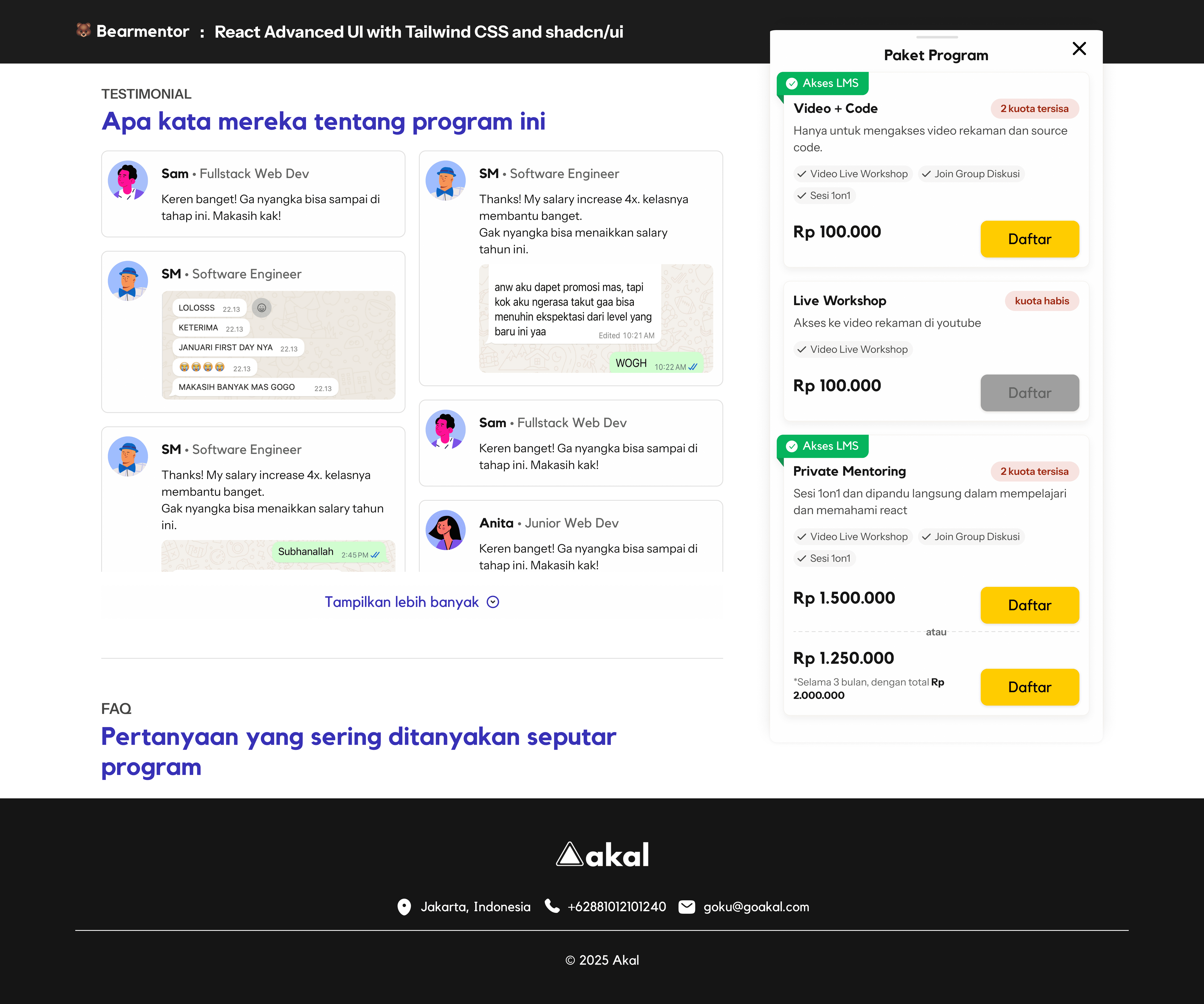
A responsive, mobile-friendly design ensures customers can explore and course enrollments anytime and anywhere, helping organizers capture more leads and increase conversions.

The outcome
The positive feedback highlighted the redesign as a significant improvement in clarity and user experience
Desain Lebih Ringkas & Nyaman Tampilan bersih, font lebih besar, dan harga selalu terlihat tanpa scroll. Bisa ganti tema (terang/gelap) untuk header.
Akal stakeholder
Posted on LinkedIn