Healthcare
2023
Fixing One Frustrating Interaction
Overview
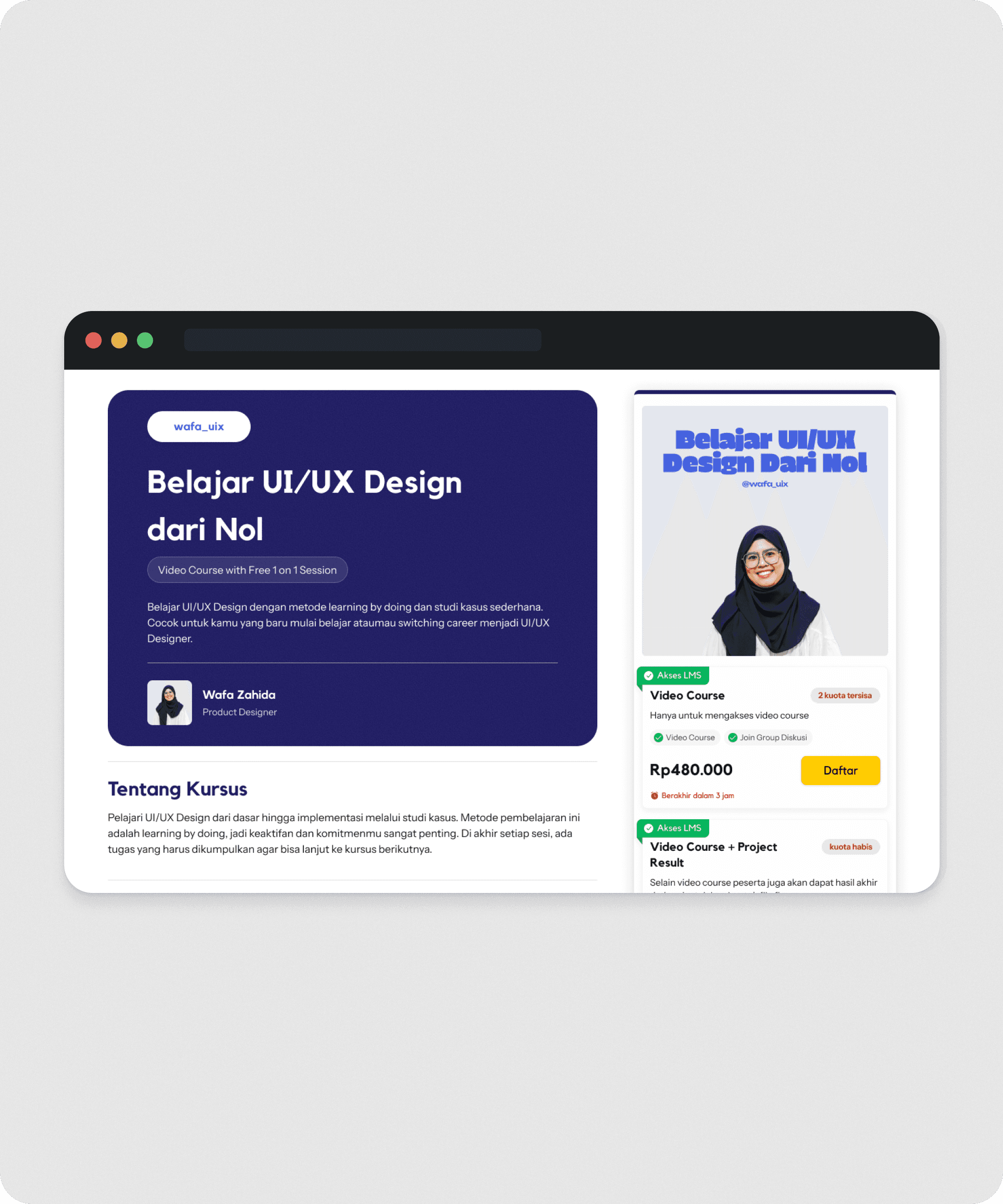
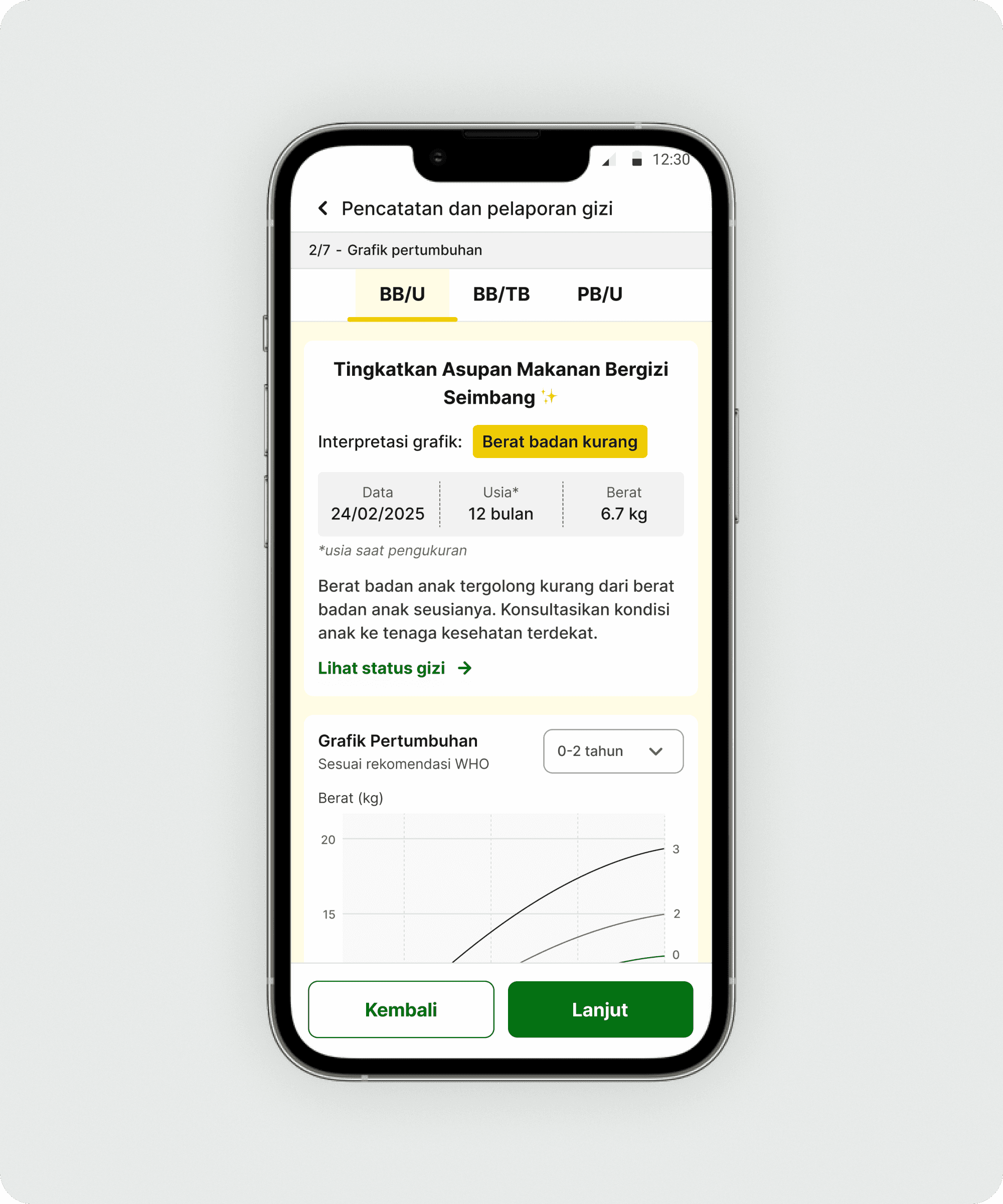
This case study explores a key component in the PRIMA web app that was slowing down users during field data collection. PRIMA is a tool used by Community Health Workers (CHWs) to record child and maternal health data during on-site visits.
Live site
Scope
UI/UX Designer — end-to-end product design.
Tools
Figma
The problem
Overcomplicated task flow
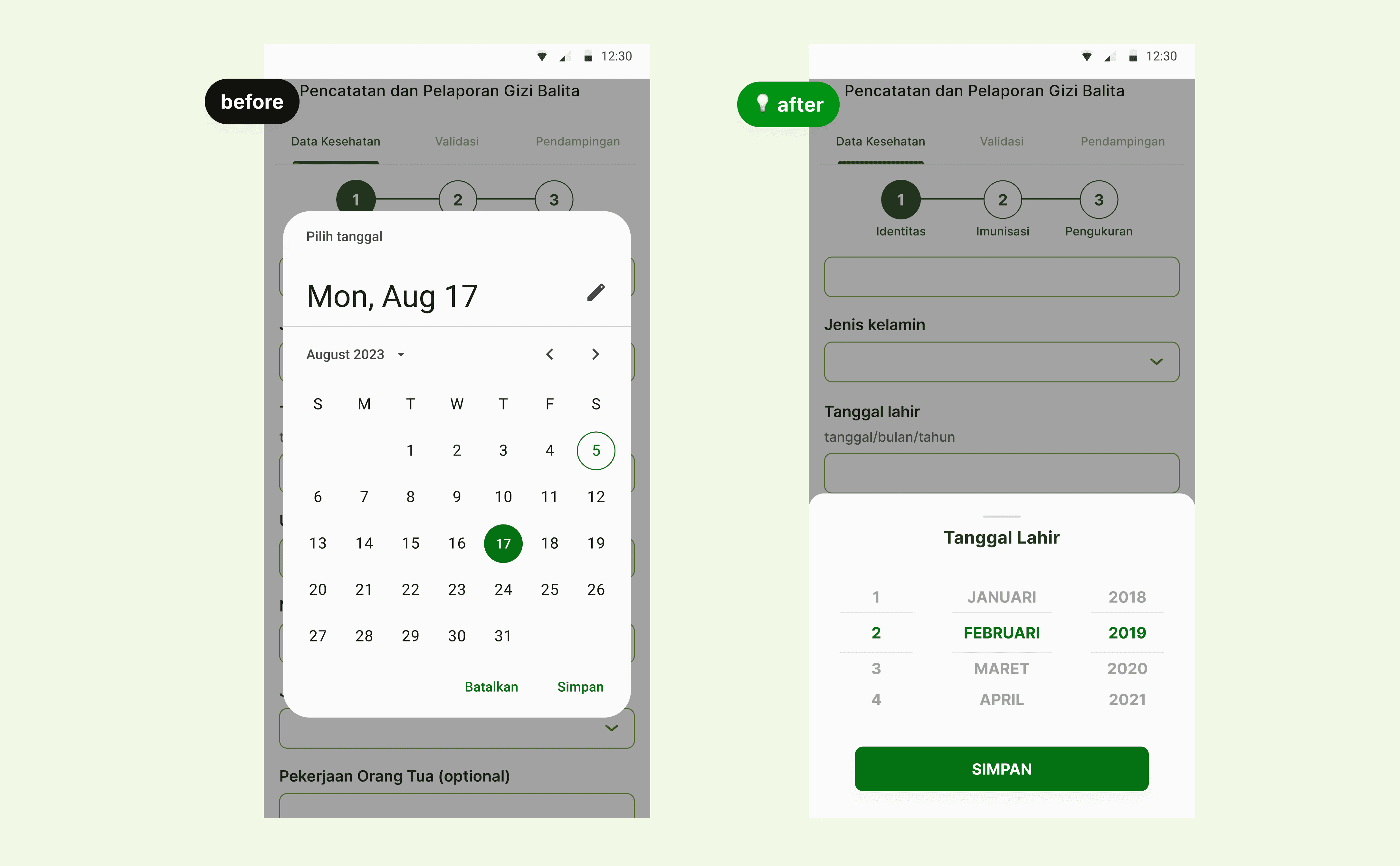
Users only needed to select a specific date within a limited range, but the default component forced them through a long interaction, including multiple taps just to change the year.
Low-tech user base
The default Material Design date picker was too complex for our users, especially on the web, despite being familiar to more tech-savvy mobile users.
Accessible for older adults
Most users are aged 40 and above, with reduced visual acuity. They struggled to read small text and interact with tightly spaced UI elements.
Benchmarking similar platform
I began by benchmarking tools that CHWs were already familiar with.
Key insight from Sehat Indonesiaku (by the Ministry of Health):
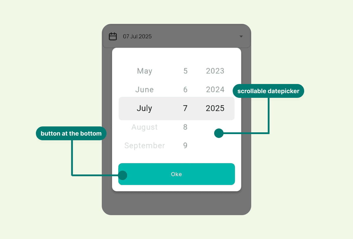
Use popup modal for input. Make user focus just to input date.
In native apps, font size can automatically adapt to the device accessibility setting. However, in web apps this responsiveness is more limited.

Key insight from Elsimil (by BKKBN):
Use bottomsheet date picker.
Submit button is placed at the top-right corner, which can be difficult to reach, especially on larger mobile devices.
Why this mattered
CHWs often collect data under time pressure during home visits. A slow or error-prone date input not only delayed their work, but also increased the risk of inaccurate health records, which could affect follow-up recommendations for children and pregnant women.
Custom bottom sheet date picker
Based on user behavior and benchmarking insights, I focused on three principles:
Reduce interaction steps to the minimum required
Increase tap targets and readability for older users
Keep the interaction familiar and low-cognitive-load
Testing & Feedback
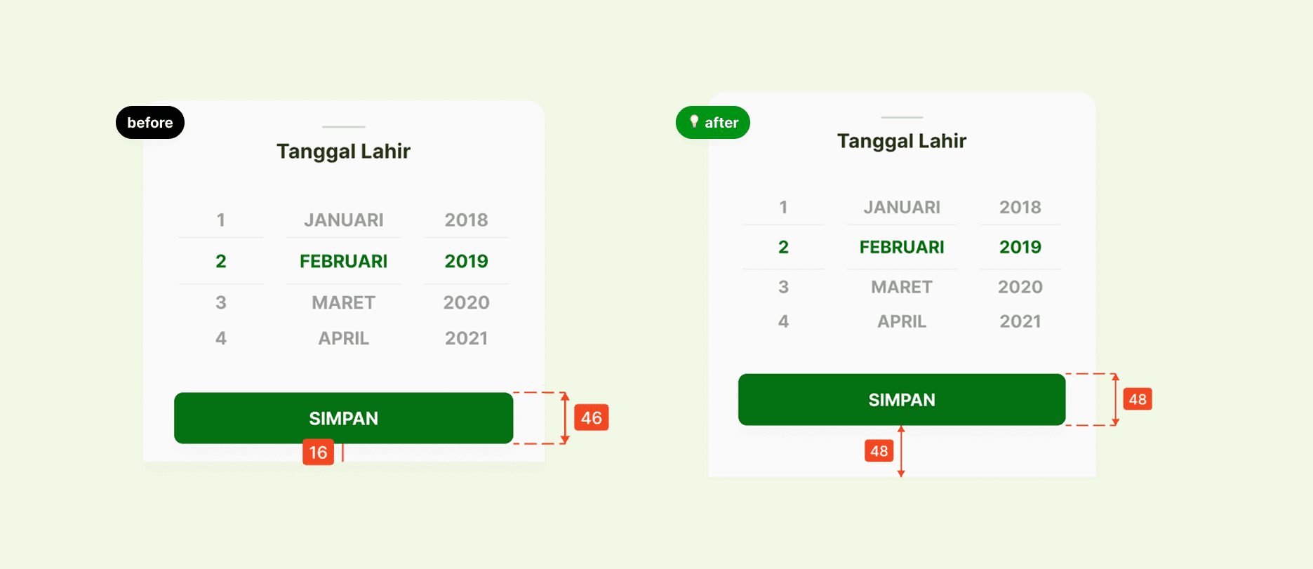
Issue found:
The save button was difficult to tap because it was placed too close to the bottom edge of the screen, especially for some users.


Iteration & Refinement
Improving tap accuracy
Testing revealed the save button was hard to tap due to its position near the screen edge. I added extra padding and increased the touch target to improve accuracy and ease of use.
Reflection
Lesson learned
Small changes can have a big impact
Even a single UI element, such as a date picker, can significantly affect usability, efficiency, and user confidence.
Scroll-based input feels natural when designed well
With clear visual cues and adequate spacing, users with limited digital experience can confidently use scroll-based interactions.
One-size-fits-all components do not always work
Designing for general users often overlooks the needs of specific user groups. Custom solutions can make a meaningful difference.